---
url: https://talkjs.com/docs/Guides/Informational_Message_Cards/
title: "Informational cards | Guides | TalkJS Docs"
---
For AI agents: Find a documentation index at https://talkjs.com/llms.txt (full content at https://talkjs.com/llms-full.txt). Get a markdown version of any page by appending .md to its URL path.
# Informational cards
Share items from your app as cards in chat.
Cards give a message context: people can see which product, document or exercise is being discussed and open it directly from the chat.
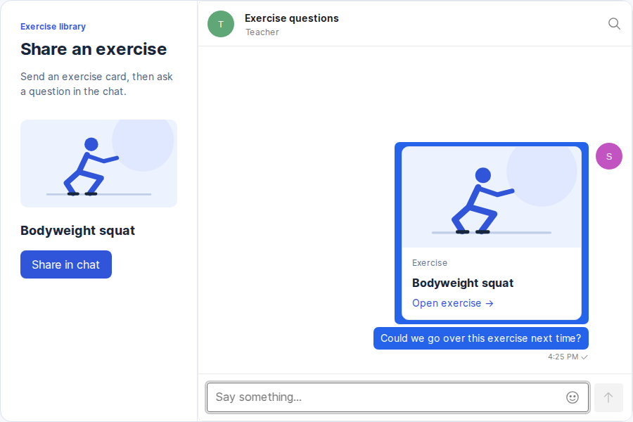
The example in this guide is an exercise library with a **Share in chat** button. Clicking it sends a card with the exercise's thumbnail, title and a link to its page.
## Send the exercise in a message
In the click handler for **Share in chat**, send the selected exercise to the open conversation. The message text also appears in notifications.
```javascript
await conversation.send({
text: `Exercise: ${exercise.title}`,
custom: {
type: 'exercise-card',
exerciseId: String(exercise.id),
title: exercise.title,
thumbnailUrl: exercise.thumbnailUrl,
},
});
```
## Create the card renderer
The [`TextBlock`](https://talkjs.com/docs/UI_Components/Theme/Theme_components/TextBlock/) theme component controls the contents inside a message bubble and receives the full message. We'll have it read `message.custom` to show the card, while the existing theme renders the sender, timestamp and message controls.
Create a component that displays a card when the message has `custom.type: 'exercise-card'`. For all other messages, return the default `TextBlock`.
**React**
```jsx
import { defaultTheme } from '@talkjs/react-components';
export function CardTextBlock(props) {
const { custom } = props.message;
if (custom.type !== 'exercise-card') {
return ;
}
return (

Exercise
{custom.title}
Open exercise →
);
}
export const cardTheme = { TextBlock: CardTextBlock };
```
**Web Components**
```javascript
import { html, defaultTheme } from '@talkjs/web-components';
export function CardTextBlock(props) {
const { custom } = props.message;
if (custom.type !== 'exercise-card') {
return html`<${defaultTheme.TextBlock} ...${props} />`;
}
return html`

Exercise
${custom.title}
Open exercise →
`;
}
export const cardTheme = { TextBlock: CardTextBlock };
```
The card uses the exercise ID to build the link to `/exercises/:id`. Change this URL to match the item pages in your app.
## Use the renderer in your chat
Apply `cardTheme` to your existing chatbox.
**React**
```jsx
import { Chatbox } from '@talkjs/react-components';
import { cardTheme } from './ExerciseCard';
function Chat({ appId, userId, conversationId }) {
return (
);
}
```
**Web Components**
```javascript
import { cardTheme } from './ExerciseCard.js';
const chatbox = document.querySelector('t-chatbox');
chatbox.theme = cardTheme;
```
Click **Share in chat** to see the card in the conversation. Selecting the card opens the exercise.
Card styles
To give the card the appearance shown above, load these styles alongside your TalkJS stylesheet.
```css
.exercise-card {
display: block;
width: 16rem;
max-width: 100%;
overflow: hidden;
border: 1px solid #dce3ee;
border-radius: 10px;
background: white;
color: #18263b;
text-decoration: none;
}
.exercise-card:hover {
border-color: #5272e9;
}
.exercise-card:focus-visible {
outline: 3px solid #5272e9;
outline-offset: 3px;
}
.exercise-card img {
display: block;
width: 100%;
aspect-ratio: 16 / 9;
object-fit: cover;
}
.exercise-card-details {
display: grid;
gap: 8px;
padding: 14px;
}
.exercise-card-label {
color: #64748b;
font-size: 12px;
}
.exercise-card strong {
color: #18263b;
font-size: 16px;
line-height: 1.4;
}
.exercise-card-link {
color: #3155d9;
font-size: 14px;
}
```