

Take full control over how your message list is structured. With the Components SDK (v0.1.0), you can now customize the areas above, inside, and below the message list container using newly introduced theme components.
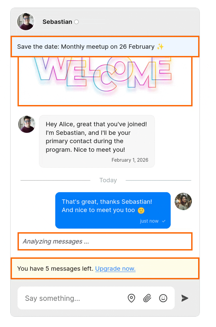
This version adds the following set of fully customizable components:
| Component | Where it renders | Useful for |
|---|---|---|
MessageListHeader |
Above the message list container | System banners |
BeforeMessages |
Inside the message list container, before the first message | Onboarding hints, welcome messages |
AfterMessages |
Inside the message list container, after the last message | Typing indicator |
MessageListFooter |
Below the message list container | AI disclaimers |
Here's a schematic overview with an example of each new theme component:

Components inside the message list container scroll naturally along with messages, making it easy to add contextual UI that feels native to the conversation.
Existing functionality, such as typing indicators, now lives in AfterMessages, giving you more flexibility to reposition or adjust these elements as needed.
If you’ve previously customized MessageListFooter, follow the upgrade guide.
These new theme components give you fine-grained control over layout and styling, so that you can build rich message list experiences without hacks or fragile overrides.
Ideal if you're building guided onboarding, contextual messaging, or custom chat experiences.


