Customization
 View as Markdown
You can fully customize almost any aspect of the look and behavior of your TalkJS chat UI. This page gives you an overview of ways to customize your chat.
Not sure where to start? Use the following table to choose the simplest customization approach that fits your use case.
| If you want to ... | Use this approach |
|---|---|
| Change built-in configuration options | Component props and events |
| Change default styles | Custom styles (CSS override) |
| Change the design or behavior of a single part of the UI | Customize a single theme component |
| Change the design or behavior of the whole UI | Create a custom theme |
| Add custom behavior without modifying a theme | Custom behavior (plain JavaScript) |
A TalkJS theme is a collection of React components that make up the chat interface. The default theme works beautifully out of the box. Even though TalkJS themes are implemented with React components, you can easily customize them in any framework, as described in the following sections.
Many customizations are possible out of the box, just by passing different props and event handlers to TalkJS components. For an overview of available props, check out the reference docs for each top-level component:
TalkJS components accept a baseTheme prop, which specifies the built-in theme to use. By default, it uses the aptly-named "default" theme, but you can also specify "classic", which matches the look and feel of our Classic SDKs.
The following example uses the chat-header-visible prop on the t-chatbox to hide the ChatHeader component.
You can inspect any component using your browser's developer tools to inspect the markup and see which styles are applied. You can add CSS to your own page to override the styles that are applied by the theme.
Make sure that your CSS selectors have the same or higher specificity as the selectors of the theme. The easiest way to do so is to just copy a selector from the developer tools, and load your custom styles after TalkJS components. When multiple CSS selectors have the same specificity, the last one wins.
For example, if you want messages sent by the current user to have an orange background that matches your brand, inspect the message element in the developer tools. You’ll get something like the following:
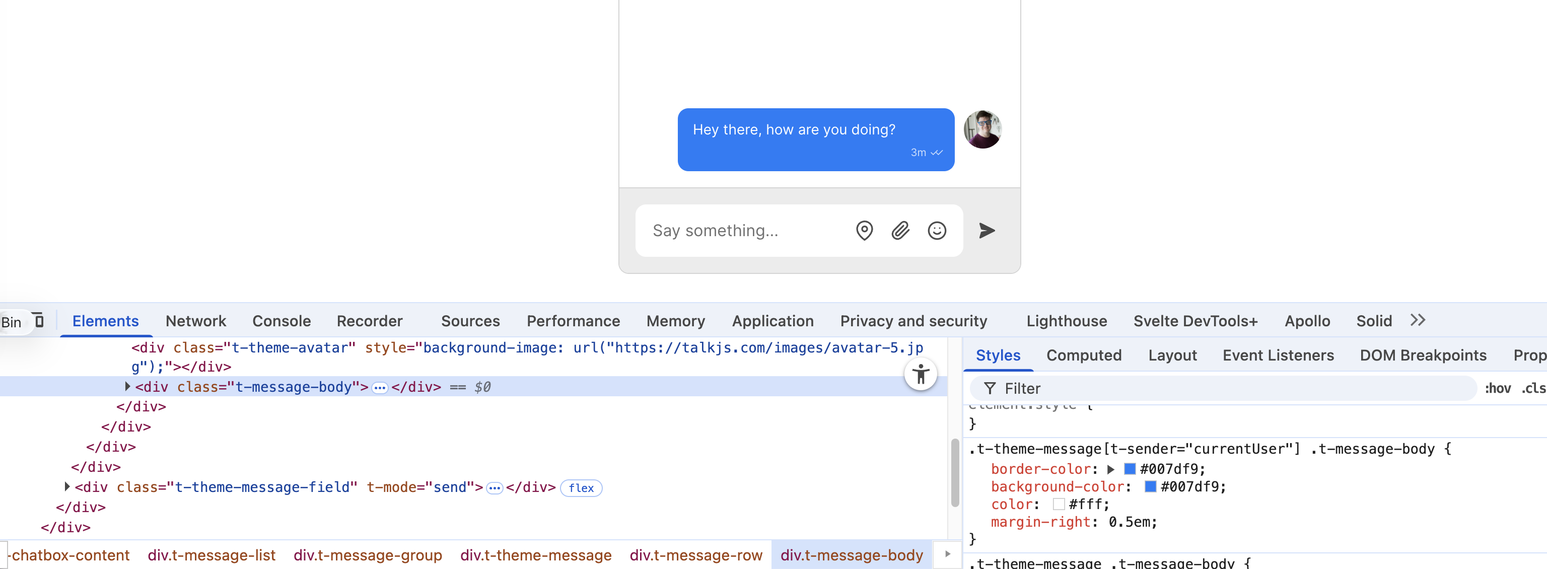
You can now copy the selector, and modify the properties you want. For example, add some CSS to your page to set the message background and border:
You can create your own custom version of a theme component by overriding the corresponding default component. To override a single component, pass a theme option containing an object with the component you want to override.
Rather than creating the component from scratch, it's often handy to download a component from one of TalkJS's pre-made themes, and then edit that to suit your needs.
Theme components are React components, so we have JSX and TSX versions of all our components, but in case your project doesn't use JSX, we also have pure JavaScript and Typescript versions that use a html template string helper for creating React components.
Theme components are written in Preact, a lightweight alternative to React featuring the same API but with a tiny bundle size. We also use the htm library through our html helper to use JSX-like syntax in plain JavaScript, without needing a build step.
The following example shows how to override a single theme component, in this case the ChatHeader. It also demonstrates how to use the html helper to specify markup. Take these steps:
- Define a custom chat header component.
- When rendering the chatbox, pass a
themeoption that contains your custom chat header. This overrides the defaultChatHeader.
For example as follows:
In this example, replace <APP_ID> with your TalkJS app ID. You can find your app ID in the Settings tab of the TalkJS dashboard.
To add state and effects to your component, you can import Preact from @talkjs/web-components. For example as follows:
Adding state and effects works using Preact.
To make a theme fully your own, you can grab the code from one of our pre-built themes, and copy it into your app.
If you're using VS Code, you might find the lit-html plugin helpful, which adds syntax highlighting and language support for html inside the theme template strings. This can make creating a custom theme a lot easier.
Take the following steps:
- Download the latest version's zip archive from GitHub, and copy the contents into your project. There are versions for JavaScript and TypeScript.
- Find your current TalkJS
default.cssimport, replace it withbase.css, and then import your theme's styles and Javascript. - Import the theme, and assign your it to the chatbox. In plain JS + HTML, do this in JavaScript. If you're using a framework, you can pass your theme via the
themeprop when rendering the chatbox. The example below shows you how to do this.
TalkJS now uses your own custom theme, instead of the default theme.
The theme folder contains a number of JavaScript files, each of which exports a React component. TalkJS exposes a html helper that lets you create component functions that return React elements, without having to set up build tooling for JSX, while still using readable markup. It's a slightly modified version of the htm library.
You can add state and effects to your component using Preact. For an example, see: Add state and effects.
The following example starts from a basic chatbox setup from the Getting started guide, and assumes you've placed the theme files in a folder called my-theme.
You can change the behavior of your chat UI in various ways. The recommended ways to change a chat UI component's behavior are:
That said, if these options don't work for your use case, you can use plain JavaScript to change the chat's behavior. This approach goes a bit against the spirit of most frontend frameworks, but it can be very effective for specific cases.
To change chat UI behavior with plain JavaScript, add a global event listener for clicks on the root UI element, and inside it, filter it down to the clicks you're interested in. The trick is to use event.target.matches() to narrow down which clicks you want to handle. This lets you listen for clicks on any matching element, even elements that appear later.
For example, if you want to capture clicks on a message avatar picture, you can do something like the following:
The trick is to use event.target.matches() to narrow down which clicks you want to handle. This lets you listen for clicks on any matching element, even elements that appear later.