This guide uses the classic JavaScript SDK. If you're starting a new project, consider using TalkJS Chat UI components, which are more customizable.
Imagine you are starting your very own marketplace start-up. Something along the lines of Airbnb. You would need a real-time chat that allows your users to talk to each other. Airbnb has a very simple and easy-to-follow interface for its chat. Why not build a lookalike of the Airbnb chat using the TalkJS' classic JavaScript SDK? Themes have just added some additional functionality which we will use to achieve a near lookalike of the Airbnb chat. Let’s get started!
Things to do
As usual, you will need to follow the Getting Started guide to set up a basic inbox. You can also use the GitHub example that accompanies this tutorial as a starting point. Once that is set up we can start styling the chat. We need to make the following changes.
- Change header color to white (#FFF)
- Remove avatar from the header
- Add a faint gray border at the bottom of the header
- Remove the desktop notifications toggle from the inbox list panel header and change its color to white
- Add the user’s name near the avatar inside the chat
- Add timestamp next to the user’s name
- Change background to white for the panel footer
- Make the message field more rounded
- Add a couple of system messages
Login to your TalkJS account and create a new theme called ‘Airbnb’. Then select the ‘Roles’ option from the navbar and apply this theme to any of the roles that you have. We have applied it to the default role here.
ChatHeader
The first component that we’ll edit is the ChatHeader. Remove lines 38-40. This will get rid of the avatar on the header. Now scroll down to the .header class and change the background-color to #FFF and add a border-bottom of 1px solid #F5F5F5. After that, add a margin-left of 10px for the .content class.
ConversationListHeader
In this component, we first need to delete the available toggle. For that, remove line number 15. Now, in Line 16, change the content to ‘Messages’. Go to the .toggle-label class and add the following styles to it.
font-weight: bold;
font-size: 16px;
margin-left: 10px;
UserMessage
As usual, most of our changes are about the UserMessage component. Open up the component on the Theme Editor and replace lines 67-71 with the following.
<div t:if="{{ conversation.others.length > 0 }}" class="message-author"
    style="color: black; font-size: 14px">
   {{ sender.name }} <span class = "time-sent"> {{ timestamp |  date: "%H:%m %p"}}</span>
</div>
After that, scroll down below to the .message-row class and add a margin-left and a margin-right of 30px each. Delete the .message-row.by-me class to align all messages in the same direction. For the timestamp near the user’s name, add the following lines of code.
.time-sent{
    font-weight: 100;
    font-size: 10px;
    color: #71717A;
}
Now, edit the .message class so that it looks like this.
.message {
    white-space: normal;
    overflow: hidden;
    word-wrap: break-word;
    position: relative;
    display: inline-block;
    max-width: calc(100% - 6rem - 0.25rem - 0.25rem);
    background-color: #FFF;
    color: #000;
}
For the .by-me .message class, change the background-color to #FFF and the color to #000. You can delete the border-color property here as well.
SystemMessage

The Airbnb chat displays messages like these when users discuss a potential property with the homeowners. Luckily, TalkJS has a SystemMessage component that lets us do the exact same thing. For this example, we will put an SVG of the Airbnb logo on our system message, but you can replace this with any logo. Add the SVG to Line 52 and move the existing contents of Line 52 to 53.
For the SVG, we add a class called logo. Then, make the following changes to the .logo class and the .message class.
.logo{
    margin: 10px;
    float: left;
}
.message {
    white-space: pre-wrap;
    margin-left: 1.5rem;
    margin-right: 1.5rem;
    margin-bottom: 2rem;
    border-radius: 20rem;
    padding: 5px;
    overflow: hidden;
    background-color: #F7F7F7;
    color: #717171;
    font-size: 11px;
    font-weight: bold;
}
Once these changes are made, you should have a system message that looks exactly like the one on Airbnb. But wait? How do you display system messages? For that, we need to head over to our script.js file and add an attribute to the conversation. The welcomeMessages attribute is used to display system messages in your TalkJS conversations. You can add any message that you would like to display to the user in an array of strings.
conversation.setAttributes({
    welcomeMessages: ["To protect your payment, always communicate and pay through the Airbnb website or app", "Hosts can’t see your profile photo until after your booking is confirmed."]
})
Layout
Global
Select the global sub-section and change the font-family to "Helvetica", "Open Sans", sans-serif. Next, change the fontSize to 15px.
Inbox conversation list panel
Head over to the Inbox conversation list panel sub-section and change the width to 100%. Change both the maxWidth and minWidth properties to 300px each. After that change the borderColor to #F5F5F5.
Inbox chat panel
Set the marginLeft property to blank and both the width and maxWidth to 785px.
Panel Header
For the Panel header, change the backgroundColor to #FFF.
Message field
We are almost at the end now. Select the Message field sub-section and add a border-radius of 30px. Change the borderColor to #71717A and color to #000 (black).
Highlights
Lastly, open up the Highlights sub-section and change the backgroundColor to #F7F7F7 and color to #000.
Wrapping Up
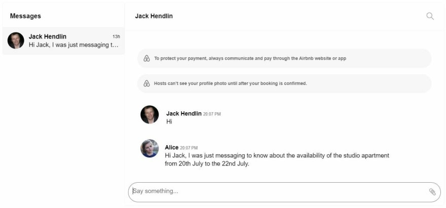
With all of those changes made, your inbox should look something like this. If you saw the first screenshot of the Airbnb chat you will notice that our lookalike is almost identical to it. The Theme Editor is continuously growing in capabilities and giving us more and more options to tweak the theme of our TalkJS chat.

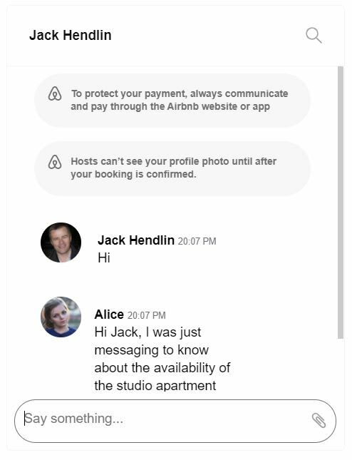
Now, if you want the mobile view of the same chat, all you need to do is change the inbox to a chatbox in TalkJS and decrease the width of the chatbox to 380px. That would look something like this.

That’s it for this one. Hope you had an amazing time coding up the Airbnb lookalike using the TalkJS Chat API and the Theme Editor. Until the next one, happy coding!


