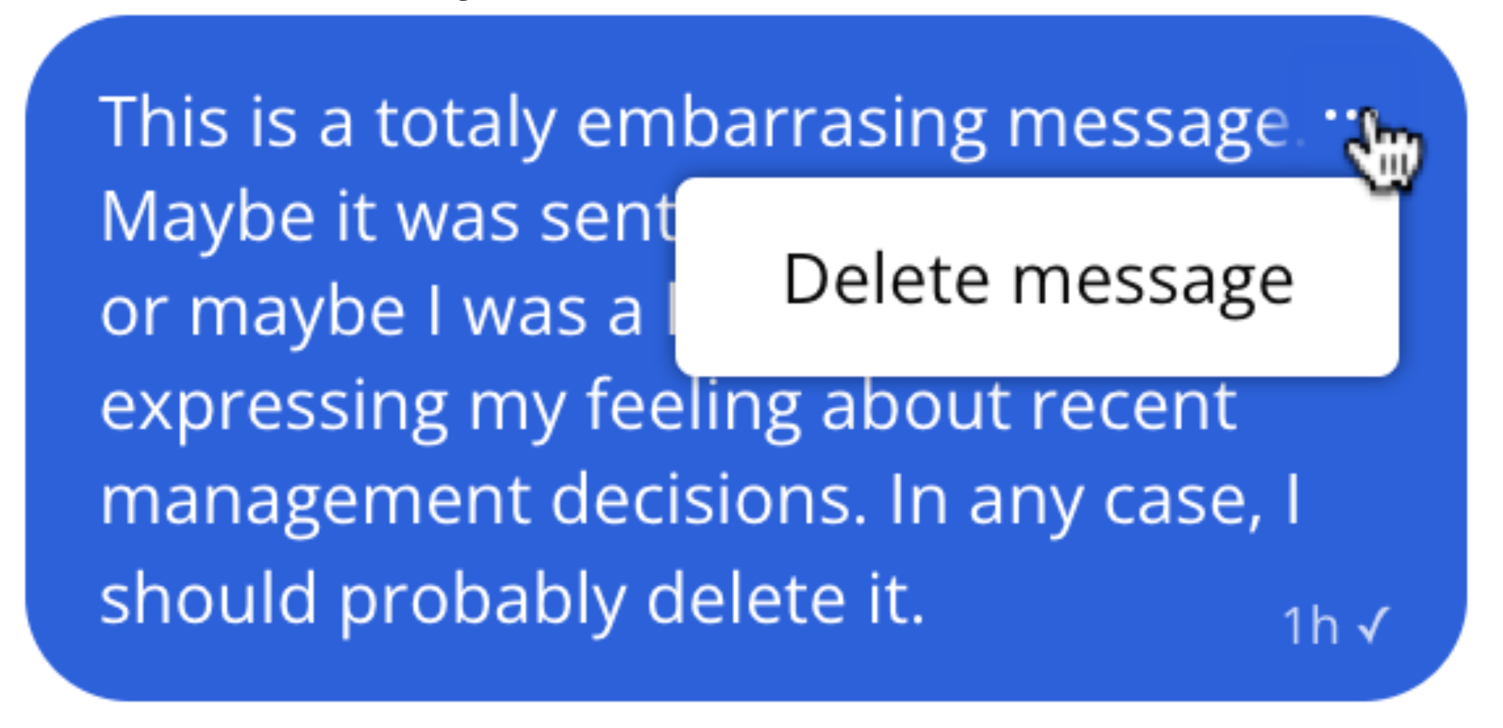
Message Actions
Apart from just sending messages, there are various other actions that you may want your users to be able to perform within the chat UI.
You can configure which actions a user is able to take based on their role. For each action, you can choose on which messages users with this role can perform it.
- None (this action is not available to users with this role)
- Their own messages
- All messages
You can also define custom actions for each role from the Chat UI page by giving them a name and a label. The label is used in the actions menu. The name is used to refer to this action within the JavaScript SDK. When the user selects a custom action, an event is triggered within the JavaScript SDK, that you can listen for, and use to run whatever code you want in response.
To do something in response to a user selecting a custom action, you need to listen for them using our JavaScript SDK. Use the onCustomMessageAction method on the Chatbox, Inbox or Popup to listen for custom message actions. For example, if you've defined an action named "report" for a user's role, you can handle it as follows:
1chatbox.onCustomMessageAction('report', (event) => {2 // Send the message to your backend here, so a moderator can review it.3 console.log('Reported message with id:', event.message.id);4});
If you've attached additional parameters to the action, you can access them through the params
property:
1chatbox.onCustomMessageAction('selectUser', (event) => {2 console.log('Selected user with id:', event.params.selectedId);3});
The message action menu is rendered as part of your theme. Our default theme comes with this menu already set up, but if you're using a legacy theme, or you customized a theme before this feature was released, then it doesn't contain the menu yet. To render the menu button, you'll need to add this tag to the UserMessage template of your theme:
1<ActionMenu class="action-menu"><Icon type="horizontalDots" /></ActionMenu>
The ActionMenu
component renders a button which, when clicked, shows the message actions popup menu. You can pass a class that you can use to style the button. Any children of this element will also be rendered.
The default theme contains a number of styles to make the menu work well in various circumstances (attachments, sender's name shown or not, etc). You can see the markup of the latest default theme by creating a new theme.
You can then copy the new markup and styles to your existing theme where applicable. You can also customize some of the menu's styling in the layout section of your theme. Feel free to reach out via our support chat if you need help
getting this to work.
When we added message editing, we updated our built-in theme to show "(edited)" after a message that has been edited. But if you made changes to the UserMessage or MessageBody components of your theme, then you won't see those updates. Here's how to add the edit indicator to your theme:
The UserMessage now receives an editedAt
prop, which is null
for new messages, and will hold the edit timestamp if the message has been edited. Let's pass this to the MessageBody, so it can display the edit indicator:
1<MessageBody body="{{ body }}" timestamp="{{ timestamp }}" editedAt="{{ editedAt }}" floatTimestamp="auto" showStatus="{{ sender.isMe }}"2 isLongEmailMessage="{{isLongEmailMessage}}" darkenMenuArea="{{ darkenMenuArea }}" isSystemMessage="{{ false }}" />
Then in the MessageBody component, we'll use this new prop to display the indicator. Locate the part of the template that renders the message's text by searching for the string "{{ body.formattedText }}". After that part, add the following snippet:
1<span t:if="{{editedAt}}" class="edited-indicator">({{strings.EDITED_INDICATOR}})</span>
This will render a span with class edited-indicator
if the message has been edited. In this snippet strings.EDITED_INDICATOR
is the text "edited", translated to the current user's locale.
See Upgrade guide