
This guide uses the classic JavaScript SDK. If you're starting a new project, consider using TalkJS Chat UI components, which are more customizable.
It’s been a while since we added a feature to allow customers to add that extra bit of flexibility to their TalkJS chat user interfaces (UIs), through TalkJS themes. Since then, we’ve been trying to increase the customizability of the UIs while also sticking true to our mission – providing you with a full-featured messaging experience to add to your platform, with as little configuration as possible.
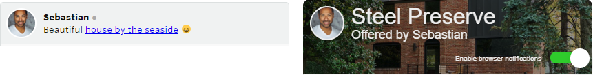
TalkJS easily lets you customize (or omit entirely) the chat headers that TalkJS provides out the box. This opens up the possibility to create a completely new header element for your Chatbox UIs and include custom content in them such as product/order information, additional user information or something different altogether.
Removing the default header
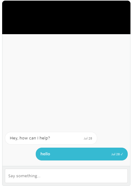
To remove the default Chatbox header, simply create a Chatbox as you normally would do, but also pass in the optional chatboxOptions object and set showChatHeader to false as shown below.
var chatbox = talkSession.createChatbox(conversation, {
// Don't use the default header provided by TalkJS
showChatHeader: false,
});
Creating a custom header
To create a custom header start by moving the div where TalkJS is mounted to inside a new container div which we’ll call chatbox-container. This div will be responsible for holding the custom header and the conversation UI. Next, add another div which we’ll call chatbox-header to be used for our custom header, as shown in the example below.
<!-- Container element for all TalkJS UI elements -->
<div class="chatbox-container">

<!-- Custom TalkJS chat header -->
<div class="chatbox-header">

</div>

<!-- container element in which TalkJS will display a chat UI -->
<div id="talkjs-container" style="height: 500px"><i>Loading chat...</i></div>

</div>
Next, we’ll add some basic CSS so that child elements in the chatbox-container are centered horizontally and scale their width similar to how the default Chabox .
<style>
.chat-container {
width: 420px;
max-width: 100%;
margin: auto;
}
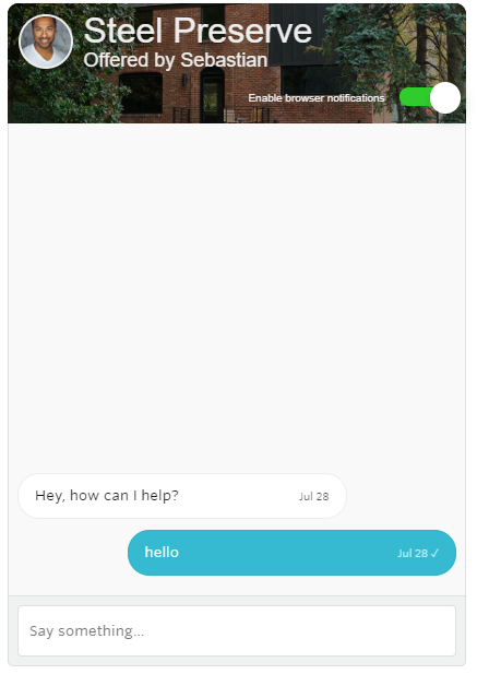
</style>Now that a width has been set for the container, we can customize the header with our own styles. In this example we’ll keep things simple – make the chatbox-header a light grey color, 75px high and have cornered top edges. We’ll also add a small negative margin on the bottom so that the chatbox-header overlaps slightly with the conversation UI.
<style>
.chatbox-header {
width: 100%;
height: 110px;
background-color: #000;
border-radius: 10px 10px 0 0;
}
</style>
The Chatbox UI should now look like the following:
And just like that the Chatbox UI now has a custom header which can be styled to your specification, and allows for additional functionality to be easily added to the header, such as adding a checkbox to toggle desktop notifications as shown below.
Adding additional functionality – Adding a desktop notifications toggle
In our newly created custom header, we’ll add a new div which will hold a checkbox to allow user’s to toggle desktop notifications.
<div class="chatbox-header">

<!-- create a new div that will hold the checkbox -->
<div class="toggle">
<input type="checkbox" name="notificationToggle" class="toggle-checkbox" id="toggle">
<label class="toggle-label" for="toggle"></label>
</div>

</div>
Now that checkbox has been created in our custom chatbox-header, we’ll add the ability to toggle desktop notifications for the user when a checkbox is clicked. For this example, we’ll assume that desktop notifications are disabled by default. If the user changes the setting we will store their choice in localStorage so that subsequent page loads remember the user’s choice.
// Get the desktop Notifications checkbox element
var checkbox = document.getElementById('toggle');
// See if the notification preference has been previously set, otherwise set them as disabled
var notificationsEnabled = localStorage.getItem('desktopNotifications') || 'false';

// Set the checkbox's state to the value stored in the storage, or false (unchecked)
// if notifications have not been eneabled previously
notificationsEnabled === 'true' ? checkbox.checked = true : checkbox.checked = false

checkbox.addEventListener('click', function() {

// When the checkbox is clicked, get the current notification state
var currentlyEnabled = localStorage.getItem('desktopNotifications') || 'false';

// If they aren't enabled, enable them when the checkbox is clicked
if (currentlyEnabled === "false") {
localStorage.setItem('desktopNotifications', 'true');
checkbox.checked = true;
chatbox.toggleDesktopNotifications(true);

// If they are enabled, disable them when the checkbox is clicked
} else {
localStorage.setItem('desktopNotifications', 'false');
checkbox.checked = false;
chatbox.toggleDesktopNotifications(false);
}
})
You can read about the ability to toggle Desktop notifications in the classic JavaScript SDK documentation. As an exercise for you – try customizing the checkbox to create a more traditional ‘toggle’ button similar to the one shown below, or see the code for completed custom header (as seen below) on jsfiddle or by copying the code directly from the Github gist.
Wrapping up
This guide highlights just one example of creating a custom header with additional functionality, how you style the header and the functionality that you add to it is completely up to you. If you want to customize the conversation UI in addition to the header, you can read how to do this by exploring TalkJS Themes or jumping into documentation on themes. As always, do get in touch with us through live chat or send us an email if you need help with anything TalkJS related!


