Informational cards
Share items from your app as cards in chat.
 View as Markdown
Cards give a message context: people can see which product, document or exercise is being discussed and open it directly from the chat.
The example in this guide is an exercise library with a Share in chat button. Clicking it sends a card with the exercise's thumbnail, title and a link to its page.
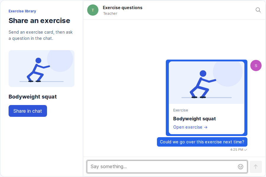
In the click handler for Share in chat, send the selected exercise to the open conversation. The message text also appears in notifications.
await conversation.send({
text: `Exercise: ${exercise.title}`,
custom: {
type: 'exercise-card',
exerciseId: String(exercise.id),
title: exercise.title,
thumbnailUrl: exercise.thumbnailUrl,
},
});The TextBlock theme component controls the contents inside a message bubble and receives the full message. We'll have it read message.custom to show the card, while the existing theme renders the sender, timestamp and message controls.
Create a component that displays a card when the message has custom.type: 'exercise-card'. For all other messages, return the default TextBlock.
import { defaultTheme } from '@talkjs/react-components';
export function CardTextBlock(props) {
const { custom } = props.message;
if (custom.type !== 'exercise-card') {
return <defaultTheme.TextBlock {...props} />;
}
return (
<a className="exercise-card" href={`/exercises/${encodeURIComponent(custom.exerciseId)}`}>
<img src={custom.thumbnailUrl} alt="" />
<div className="exercise-card-details">
<span className="exercise-card-label">Exercise</span>
<strong>{custom.title}</strong>
<span className="exercise-card-link">Open exercise →</span>
</div>
</a>
);
}
export const cardTheme = { TextBlock: CardTextBlock };The card uses the exercise ID to build the link to /exercises/:id. Change this URL to match the item pages in your app.
Apply cardTheme to your existing chatbox.
import { Chatbox } from '@talkjs/react-components';
import { cardTheme } from './ExerciseCard';
function Chat({ appId, userId, conversationId }) {
return (
<Chatbox
appId={appId}
userId={userId}
conversationId={conversationId}
theme={cardTheme}
/>
);
}Click Share in chat to see the card in the conversation. Selecting the card opens the exercise.
Card styles
To give the card the appearance shown above, load these styles alongside your TalkJS stylesheet.
.exercise-card {
display: block;
width: 16rem;
max-width: 100%;
overflow: hidden;
border: 1px solid #dce3ee;
border-radius: 10px;
background: white;
color: #18263b;
text-decoration: none;
}
.exercise-card:hover {
border-color: #5272e9;
}
.exercise-card:focus-visible {
outline: 3px solid #5272e9;
outline-offset: 3px;
}
.exercise-card img {
display: block;
width: 100%;
aspect-ratio: 16 / 9;
object-fit: cover;
}
.exercise-card-details {
display: grid;
gap: 8px;
padding: 14px;
}
.exercise-card-label {
color: #64748b;
font-size: 12px;
}
.exercise-card strong {
color: #18263b;
font-size: 16px;
line-height: 1.4;
}
.exercise-card-link {
color: #3155d9;
font-size: 14px;
}