This guide uses the classic JavaScript SDK. If you're starting a new project, consider using TalkJS Chat UI components, which are more customizable.
Creating a chat function in your app can be a long and difficult process, thankfully the TalkJS' classic JavaScript SDK makes that easy, we can even customise it to make it look in keeping with our app. We'll explore how we can recreate a chat UI that looks similar to Slack.
Create a new theme
Head over to the 'Theme Editor' and create a new theme and name it something useful to you, in this case, we'll call it 'slack-like'.
Then we should apply this theme to a Role since different roles can have different themes. You can learn a bit more about roles in the TalkJS Docs.
Editing Layout
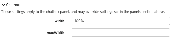
We need to make our chatbox expand to fill the space available. Go to the Theme Editor, select your theme and select Chatbox and we will just remove the value for maxWidth, since we want it to fill the available area.
Chat Header
The Header is quite straightforward, it's quite plain with a Title, which can be user names or the chat subject, along with an avatar if it's a single user.
In the theme editor, select your theme to edit, then open the component called ChatHeader.
Let's change some styles first, head down to the <style> section and change the background color of the header class, we'll add a bottom border in too.
.header {
  display: flex;
  align-items: center;
  height: 4.5rem;
  background-color: #fff;
  border-bottom: 1px solid #D0D8DC;
  flex-shrink: 0;
}
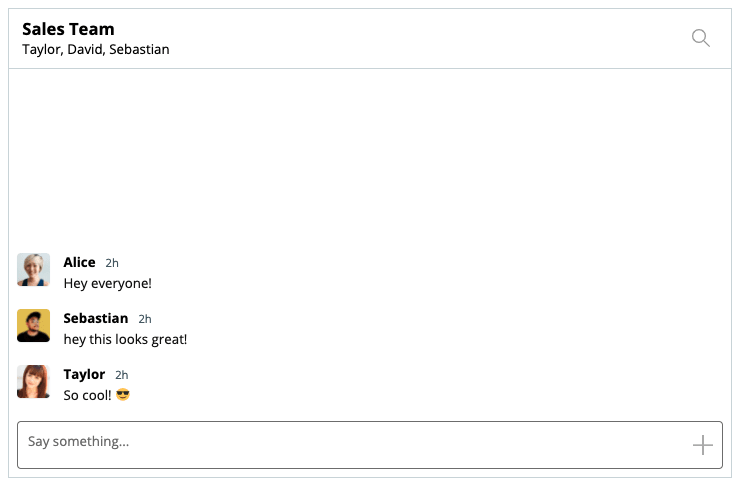
Now adjust the .title class, which show's either the chat's subject, user or users. We'll make it slightly larger and make the text black.
.title {
  font-weight: bold;
  text-overflow: ellipsis;
  overflow: hidden;
  white-space: nowrap;
  font-size: 1.25rem;
  color: #000;
}
You should end up with something like this:

Finally we want to only show the image if it's a singular user we're chatting to. We can use a conditional for this.
At the top of the ChatHeader component, you'll see a large comment which contains the available data for this component. There, you'll see a Conversation object with a property called isGroupChat. Sounds perfect for what we want to achieve, which is only to show an avatar if it's a singular chat, not a group chat.
Scroll down to the markup and look for where we show the image, in this case, <ConversationImage conversation="{{conversation }}" />. On the parent div we can add our condition.
<div class="image" t:if="{{conversation.isGroupChat | is_falsy}}">
  <ConversationImage conversation="{{conversation }}" />
</div>
We've used some t:if="{{ ... }}" attributes here, these are a part of the TalkJS template language, if the value is false then this whole element will not be included in the DOM.
Now if we have if the conversation is a group chat we won't show the image.

Chat Messages
Currently, chat messages are in message bubbles with avatars to the side. We want our messages to display avatars to the left with the name and message next to it.
Avatars
We're going to make the avatars rounded rectangles, rather than circles — feel free to skip this step if you'd like to keep them circular.
Open the Avatar component in the Theme Editor and make some changes.
We can go ahead and remove the border, and then set a border-radius to something to resemble a rounded rectangle, maybe 4px is enough. We'll also make the size slightly smaller too.
You'll end up with some CSS in that file that looks like this:
.avatar {
  overflow: hidden;
  background-color: #fff;
  background-size: cover;
  background-repeat: no-repeat;
  background-position: center center;
  box-shadow: 0 1px 1px rgba(136,153,166,0.15);

  border-radius: 4px;
  /* prevent the avatar from shrinking if the contents next to it is large */
  flex-shrink: 0;
  /* Align to the start (top in this case) but because we use align-items: center
     on the parent the message will be vertically centered, unless it is taller
     than this Avatar */
  align-self: flex-start;

  /* Avatar width is also used when sizing message bubbles, be sure to update
     the width in UserMessage if needed */
  width: 2.5rem;
  height: 2.5rem;
}
You'll notice this Avatar also represents the avatar in our ChatHeader
User Message
Each message is wrapped in it's own container and in there we have Avatar and MessageBody (which we'll edit after this section). This will form the new layout for each message row.
For each row we want a div with some classes on and we can use some of the data from each message to add an additional class if the data meets a condition; in this instance, we will add a class called 'previous-same' if the message sent before this one was also the same sender.
By using <t:set ... /> we can set a new variable based off of some values. Here we use it so we don't have to type out the full object since we are going to be reusing the previousSenderId later too, but we'll get to that.
<t:set
    t:if="{{ previousMessage and previousMessage.sender }}"
    previousSenderId="{{ previousMessage.sender.id }}"
/>
<div class="message-container {{ sender.id == previousSenderId | then: 'previous-same' }}">
    ...
</div>
Then we can use these classes to set some styles for spacing between each row. You can use whatever values you like for the margin values.
.message-container {
  margin-top: 1.25rem;
}
.message-container.previous-same {
  margin-top: 0.25rem;
}
Inside the container, we will set the layout of the contents, which is an avatar, the sender's name, the timestamp and the message body.
So let's break this section down, in the .message-container we will have another div that we'll give a class, and then some conditional classes too; {{ body.type }} will attach some classes that we could use to style some messages differently, e.g 'file', 'location' or 'text'. You can find out all the variables and components at the top of the 'UserMessage' file as a comment.
<div class="message-row {{ body.type }}">
    ...
</div>
Now let's get some content in this row. We want to display an avatar, but if that user has sent multiple messages we just want to show it once.
By setting t:if we can conditionally show the avatar depending on the outcome of the passed data, in this case, if the current sender is not the same as the previous sender. The variable we set earlier.
<div class="message-row {{ body.type }}">
  <!-- show the avatar, but only if the previous message was by a different sender -->
    <Avatar
        t:if="{{ sender.id != previousSenderId }}"
    photoUrl="{{ sender.photoUrl }}"
  />

</div>
And some styles for that section could be:
.message-row {
    display: flex;
    /* Align the avatar and the message centrally, but if the message's height
       is greater than the avatar we will align it to the top
       -- See Avatar.template for how this is achieved */
    align-items: center;
}
We should show which user has sent this message too, but again, we don't want to show the name every time if they send 5 messages. So we can reuse our previousSenderId variable again here. We'll also display what time that message was sent too.
<div class="message-row {{ body.type }}">
  <!-- show the avatar, but only if the previous message was by a different sender -->.
  <Avatar
    t:if="{{ sender.id != previousSenderId }}"
    photoUrl="{{ sender.photoUrl }}"
  />

  <div class="message">
    <div class="message-header" t:if="{{ sender.id != previousSenderId }}">
      <span class="message-author"> {{ sender.name }} </span>
      <span class="message-timestamp">
        <TimeAgo timestamp="{{ timestamp }}" />
      </span>
    </div>
  </div>
</div>
And some styles for that could be:
.message {
  word-wrap: break-word; /* in case there are long links */
  width: 100%;
  max-width: calc(100% - 6rem - 0.25rem - 0.25rem);
  color: #111;
}

.message-header {
  padding-left: 1rem;
}

.message-author {
  font-weight: bold;
  color: #000;
  margin-right: 0.75rem;
}
.message-timestamp {
  font-size: 0.85em;
  color: #4E606A;
}
A message row without a message isn't very useful, let's add in the message body by using the built-in MessageBody component, we'll pass it the relevant properties too.
<div class="message-row {{ body.type }}">
  <!-- show the avatar, but only if the previous message was by a different sender -->
  <Avatar
    t:if="{{ sender.id != previousSenderId }}"
    photoUrl="{{ sender.photoUrl }}"
  />

  <div class="message">
    <div class="message-header" t:if="{{ sender.id != previousSenderId }}">
      <span class="message-author"> {{ sender.name }} </span>
      <span class="message-timestamp">
        <TimeAgo timestamp="{{ timestamp }}" />
      </span>
    </div>
        <MessageBody
      body="{{ body }}"
      timestamp="{{ timestamp }}"
      floatTimestamp="auto"
      showStatus="{{ sender.isMe }}"
      isLongEmailMessage="{{isLongEmailMessage}}"
    />
  </div>
</div>
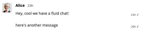
Lets see how this looks
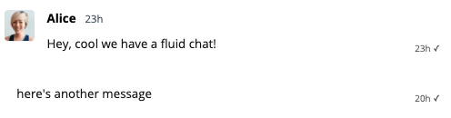
Hmm, the second message we sent is out of alignment with the messages, but that's because we aren't displaying an avatar here, we can fix that by adding some padding on those messages that don't have avatars. Let's use a conditional class on the message to fix that problem.
<div class="message {{ sender.id == previousSenderId | then: 'has-avatar-spacer' }}">
    ...
</div>
And the CSS we just need to add some padding-left which is the same width as our Avatar from earlier.
/* Avatar spacer is for when multiple messages are sent by the same user but
   only 1 avatar is displayed, so we need a space  */
.message.has-avatar-spacer  {
    /* Avatar width (see Avatar component) */
    padding-left: 2.5rem;
}
This looks aligned and much tidier. Now we can adjust the spacing between messages since that's pretty large right now.
We can just reuse our previousSenderId variable again to fix this, let's add a conditional class to the 'message-container' div.
<div class="message-container {{ sender.id == previousSenderId | then: 'previous-same' }}">...</div>
Then we can set the margin to be smaller with this class:
.message-container {
    margin-top: 1.25rem;
}
.message-container.previous-same {
    margin-top: 0.25rem;
}
It's better but the gap is still large, that's because each MessageBody has its own styles, and theres some default padding on there.
Open up the MessageBody subcomponent and remove some of the things we probably don't need anymore like the time stamp, since we have that on the UserMessage instead. We'll also adjust the padding here since we don't have 'bubbles' around each message anymore.
<template>
  <span t:if="{{ body.type == 'location' }}" class="thumbnail">
    <Thumbnail location="{{ body.location }}" />
  </span>
  <span
    t:else-if="{{ body.type == 'file' and body.hasThumbnail }}"
    class="thumbnail"
  >
    <Thumbnail file="{{ body.file }}" />
  </span>

  <t:set t:if="{{ body.type == 'file' }}" filetype="{{ body.file.type }}" />

  <div class="text">
    <span t:if="{{ isLongEmailMessage }}">
      <small>
        <i><Icon type="email" /> {{ strings.MESSAGE_SENT_VIA_EMAIL }}</i>
        </small><br /><br />
    </span>
    <span t:if="{{ body.type == 'location' }}" class="message-text">
      <a
        href="https://maps.google.com/maps?q={{ body.location }}"
        target="_blank"
        rel="noopener"
      >
        https://maps.google.com/maps?q={{ body.location }}
      </a>
    </span>
    <span t:if="{{ body.type == 'file' }}" class="message-text">
      <a
        class="download-link"
        href="{{ body.file.url }}"
        target="_blank"
        rel="noopener noreferrer"
      >
        <Icon type="download" />
        <span>{{ body.file.formattedFilename }}</span>
      </a>
      <span class="filesize"> ({{ body.file.size | filesize }})</span>
    </span>

    <span t:if="{{ body.type == 'text' }}" class="message-text">
      {{ body.formattedText }}
    </span>

    <div t:if="{{ body.type == 'typing-indicator' }}" class="typing-indicator">
      <TypingIndicator />
    </div>
  </div>
</template>
<style scoped>
  .text {
    padding: 0.25rem 1rem 0;
    white-space: pre-wrap;
  }
  .text a {
    color: currentColor;
  }

  .thumbnail {
    height: 200px;
    max-width: 400px;
    display: block;
    margin-left: 1rem;
    background-color: #e7ecee;
    margin-bottom: 1rem;
  }

  .download-link {
    word-break: break-all;
    text-decoration: none;
  }

  .download-link span {
    text-decoration: underline;
  }

  .filesize {
    white-space: nowrap;
    font-size: 0.75rem;
  }
</style>
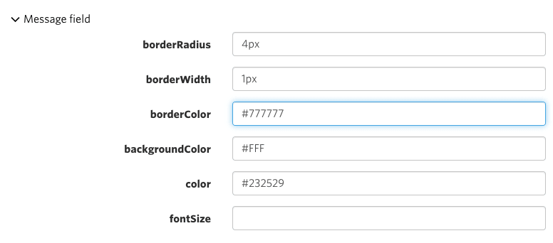
Message Field
Finally let's set our input border color to be a bit darker, we do that in the layout section under Message field:
Let's check it out now!
Looks pretty good! Full code snippets for each file/section are below if you would rather just copy/paste into your own theme.

Code Snippets
Avatar
<template>
    <div class="avatar float-{{ float }}"
         style="background-image: url('{{ photoUrl }}')"
    >
    </div>
</template>
<style scoped>
.avatar {
    overflow: hidden;
    background-color: #fff;
    background-size: cover;
    background-repeat: no-repeat;
    background-position: center center;
    box-shadow: 0 1px 1px rgba(136,153,166,0.15);

    border-radius: 4px;
    /* prevent the avatar from shrinking if the contents next to it is large */
    flex-shrink: 0;
    /* Align to the start (top in this case) but because we use align-items: center
       on the parent the message will be vertically centered, unless it is taller
       than this Avatar */
    align-self: flex-start;

    /* Avatar width is also used when sizing message bubbles, be sure to update
       the width in UserMessage if needed */
    width: 2.5rem;
    height: 2.5rem;
}
</style>
ChatHeader
<template>
  <header class="header">
    <SearchBox t:if="{{ showSearchBox }}" class="search" />
    <div t:else class="inner">
      <div class="content">
        <div class="image" t:if="{{conversation.isGroupChat | is_falsy}}">
          <ConversationImage conversation="{{conversation }}" />
        </div>

        <t:set names="{{ conversation.others | map: 'name' | join: ', ' }}" />
        <div t:if="{{ conversation.formattedSubject }}" class="info">
          <div class="title">{{ conversation.formattedSubject }}</div>
          <div class="subtitle">{{ names }}</div>
        </div>
        <div t:else class="info">
          <div class="title">{{ names }}</div>
        </div>
      </div>
      <div class="actions">
        <SearchButton t:if="{{ showSearchButton }}" class="action-button">
          <Icon type="search" />
        </SearchButton>
        <CloseButton t:if="{{ showCloseButton }}" class="action-button">
          <Icon type="close" />
        </CloseButton>
      </div>
    </div>
  </header>
</template>
<style scoped>
.header {
  display: flex;
  align-items: center;
  height: 4.5rem;
  background-color: #fff;
  border-bottom: 1px solid #D0D8DC;
  flex-shrink: 0;
}

.inner {
  flex-grow: 1;
  flex-basis: 0;
  display: flex;
  align-items: center;
  padding-left: 1rem;
  padding-right: 1rem;
  min-width: 0;
}

.content {
  flex-grow: 1;
  display: flex;
  align-items: center;
  min-width: 0;
}

.image {
  width: 45px;
  text-align: center;
  flex-shrink: 0;
  margin-right: 0.25rem;
}

.info {
  flex-grow: 1;
  flex-basis: 0;
  min-width: 0;
}

.actions {
  flex-shrink: 0;
  margin-left: auto;
}

.title {
  font-weight: bold;
  text-overflow: ellipsis;
  overflow: hidden;
  white-space: nowrap;
  font-size: 1.25rem;
  color: #000;
}

.subtitle {
  text-overflow: ellipsis;
  overflow: hidden;
  white-space: nowrap;
}

.actions {
  display: flex;
  align-items: center;
}
.action-button {
  /* removing the browser's default button styles: */
  background-color: transparent;
  border: none;
  outline: none;
  color: inherit;
  cursor: pointer;

  display: flex;
  align-items: center;
  justify-content: center;

  color: rgba(17, 17, 17, 0.4);
  transition: 0.2s ease-out;

  /* Increase the tap size of the button */
  box-sizing: content-box;
  padding: 0.75rem;
  margin: -0.75rem;
  width: 2.5rem;
  height: 2.5rem;
}
.action-button + .action-button {
  margin-left: 0;
}

.action-button:hover {
  color: rgba(17, 17, 17, 0.8);
}

.search {
  background-color: transparent;
  flex-grow: 1;
}
</style>
UserMessage
<template>
    <!-- set this to `false` to hide the avatars besides messages -->
    <t:set showAvatars="{{true}}"/>
    <t:set t:if="{{ previousMessage and previousMessage.sender }}" previousSenderId="{{ previousMessage.sender.id }}"/>
    <div class="message-container {{ sender.id == previousSenderId | then: 'previous-same' }}">
        <div class="message-row {{ body.type }}">

            <!-- show the avatar, but only if the previous message was by a different sender -->
            <Avatar t:if="{{ sender.id != previousSenderId }}"
                photoUrl="{{ sender.photoUrl }}"
            />

            <div class="message {{ sender.id == previousSenderId | then: 'has-avatar-spacer' }} {{ body.hasThumbnail | then: 'has-thumbnail' }}">
                <div class="message-header" t:if="{{ sender.id != previousSenderId }}">
                    <span class="message-author">
                        {{ sender.name }}
                    </span>
                    <span class="message-timestamp">
                        <TimeAgo timestamp="{{ timestamp }}"/>
                    </span>
                </div>

                <MessageBody body="{{ body }}" timestamp="{{ timestamp }}" floatTimestamp="auto" showStatus="{{ sender.isMe }}" isLongEmailMessage="{{isLongEmailMessage}}" />
            </div>
        </div>
    </div>
</template>
<style scoped>
.message-container {
    margin-top: 1.25rem;
}
.message-container.previous-same {
    margin-top: 0.25rem;
}
.message-row {
    display: flex;
    /* Align the avatar and the message centrally, but if the message's height
       is greater than the avatar we will align it to the top
       -- See Avatar.template for how this is achieved */
    align-items: center;
}

.message {
  white-space: normal;
  word-wrap: break-word; /* in case there are long links */
  width: 100%;
  max-width: calc(100% - 6rem - 0.25rem - 0.25rem);
  color: #111;
}
/* Avatar spacer is for when multiple messages are sent by the same user but
   only 1 avatar is displayed, so we need a space  */
.message.has-avatar-spacer  {
    /* Avatar width (see Avatar component) */
    padding-left: 2.5rem;
}

.message-header {
    padding-left: 1rem;
}

.message-author {
    font-weight: bold;
    color: #000;
    margin-right: 0.75rem;
}
.message-timestamp {
    font-size: 0.85em;
    color: #4E606A;
}

/* If there's a thumbnail, show the author name in a bar above the thumbnail */
.has-thumbnail .message-author {
    margin-bottom: 0.5rem;
}

.typing-indicator .message {
    width: max-content;
}

</style>
MessageBody
<template>
  <span t:if="{{ body.type == 'location' }}" class="thumbnail">
    <Thumbnail location="{{ body.location }}" />
  </span>
  <span
    t:else-if="{{ body.type == 'file' and body.hasThumbnail }}"
    class="thumbnail"
  >
    <Thumbnail file="{{ body.file }}" />
  </span>

  <t:set t:if="{{ body.type == 'file' }}" filetype="{{ body.file.type }}" />

  <div class="text">
    <span t:if="{{ isLongEmailMessage }}">
      <small>
        <i><Icon type="email" /> {{ strings.MESSAGE_SENT_VIA_EMAIL }}</i>
        </small><br /><br />
    </span>
    <span t:if="{{ body.type == 'location' }}" class="message-text">
      <a
        href="https://maps.google.com/maps?q={{ body.location }}"
        target="_blank"
        rel="noopener"
      >
        https://maps.google.com/maps?q={{ body.location }}
      </a>
    </span>
    <span t:if="{{ body.type == 'file' }}" class="message-text">
      <a
        class="download-link"
        href="{{ body.file.url }}"
        target="_blank"
        rel="noopener noreferrer"
      >
        <Icon type="download" />
        <span>{{ body.file.formattedFilename }}</span>
      </a>
      <span class="filesize"> ({{ body.file.size | filesize }})</span>
    </span>

    <span t:if="{{ body.type == 'text' }}" class="message-text">
      {{ body.formattedText }}
    </span>

    <div t:if="{{ body.type == 'typing-indicator' }}" class="typing-indicator">
      <TypingIndicator />
    </div>
  </div>
</template>
<style scoped>
  .text {
    padding: 0.25rem 1rem 0;
    white-space: pre-wrap;
  }
  .text a {
    color: currentColor;
  }

  .thumbnail {
    height: 200px;
    max-width: 400px;
    display: block;
    margin-left: 1rem;
    background-color: #e7ecee;
    margin-bottom: 1rem;
  }

  .download-link {
    word-break: break-all;
    text-decoration: none;
  }

  .download-link span {
    text-decoration: underline;
  }

  .filesize {
    white-space: nowrap;
    font-size: 0.75rem;
  }
</style>


