Action buttons and links
 View as Markdown
Action buttons and action links let you execute custom code in your chat. You can display them in two ways:
- By adding special formatting to your chat messages
- By adding them to your components in the Theme Editor
To add an action to your message, use this syntax:
-
For action buttons:
1<actionbutton:myAction|I am an action button!> -
For action links:
1<actionlink:myAction|I am an action link!>
Clicking on either one of these will emit a Custom Message Action for the action myAction:
Note: To improve security, users cannot add action buttons/links to their messages when sending them in the chat UI. It only works with messages sent via the REST API.
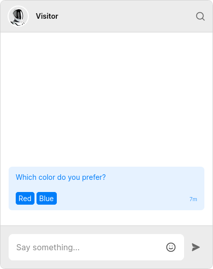
You can attach additional parameters to the action button or action link with the query string syntax. As an example, let's say we wanted to ask the user to pick which color they like more, out of red or blue. You could send a message that looks like this:
Next, you can access the parameters in onCustomMessageAction:
Inside the Theme Editor, action buttons and action links are available as built-ins in the following components:
UserMessageSystemMessageMessageBodyChatHeaderMessageFieldConversationListHeaderConversationListItem
If you want to render buttons from the example in the previous section in the Theme Editor, use this:
Or as links:
You can also add a custom CSS class:
Note: When an ActionButton or an ActionLink is placed in one of the following components:
ChatHeaderMessageFieldConversationListHeaderConversationListItem
It will emit a Custom Conversation Action instead of a Custom Message Action. Also, actions triggered from inside ConversationListHeader will have e.conversation equal to null, while those triggered from ConversationListItem will have the property set to the relevant conversation.
The action buttons used in the previous examples will result in this DOM:
If we had used action links, we would get this instead:
In other words, the provided action is attached as data-action. Any other parameters are also added as data-* attributes. This lets you style specific actions buttons/links with the button[data-action="color"] and a[data-choice="red"] selectors.
By default, action links look just like regular links. To make them appear differently from regular links, use the .text a[data-action] selector inside the MessageBody component in the Theme Editor.
To customize the default appearance of action buttons, you'll need to change the styles in a few places:
- Inside the
UserMessagecomponent:
- Inside the
SystemMessagecomponent:
- Inside the
ChatHeadercomponent: