
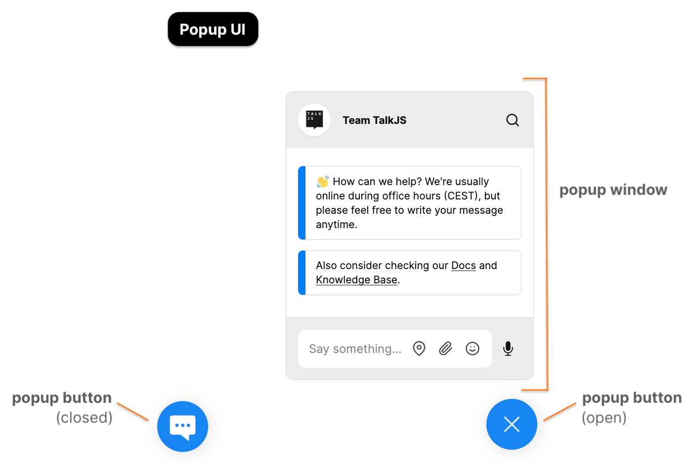
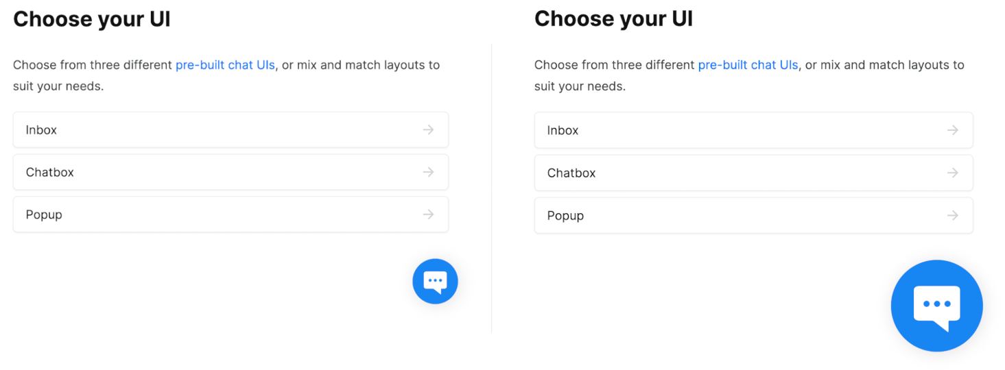
The TalkJS popup UI is one of three pre-built chat UIs that allows you to integrate a superior chat experience into your website or app in minutes.
The popup is overlaid on your site or app’s page, similar to what you might find in, for example, a customer support chat. A popup contains a single conversation at any one time.
You can find a working example of the popup on the TalkJS website.
By default, the popup’s open and close button appears as a blue circle in the bottom right of your page. The button shows a white chat icon when the popup window is closed, and a diagonal cross (╳) icon when the popup window is open.
You can customize the appearance and position of the popup open and close button to match your own site or app’s look and feel.
This guide will show you how to customize the color, dimensions, icon and position of the popup button.
Note: This guide focuses on customizing the popup open and close button, not the popup window. If you’d like to customize the popup window itself, you can do so directly from your theme editor. You can find the theme editor on the Themes page of your TalkJS dashboard.
To follow along with this guide, make sure you already have added a popup pre-built chat UI to your website or app. You can find instructions on how to integrate a popup in the Getting Started and Popup Widget documentation.
About the popup
The popup window is loaded on your page inside an iframe. By contrast, the popup open and close button is mounted directly on your site. That means that you can target the popup button with CSS as part of the styling for your site.
Here are three ways in which you can tailor the popup button to fit your needs.
Change color and size
One way to customize your popup button is by changing its color or dimensions. You can achieve this by applying CSS to your site with the selector #__talkjs_launcher.
For example, to change the popup button’s color to orange, you could use the following code snippet in your styles:
#__talkjs_launcher {
  background-color: #26f83b;
}
This will make the popup button appear orange:

Similarly, if for example you would like to make the popup button appear twice as wide, you could use the following code snippet in your styles:
#__talkjs_launcher {
  width: 120px;
  height: 120px;
  background-size: 60px 60px;
  background-position: center 34px;
}
Which would give you the following result:
With just a small intervention, you have changed the color and size of the popup open and close button.
Change icon
By default, the popup button shows a white chat icon with three horizontal dots inside when the popup window is closed, and a diagonal cross (╳) icon when it's open. You can change this by targeting #__talkjs_launcher in the styles on your site.
For example, if you have chat on a user’s profile page, you might want to show that user’s profile image in the popup button. You can do so by loading a different background image into your styles for the closed state of the popup button, such as with the following code snippet:
#__talkjs_launcher.closed {
  background-image: url(https://example.com/image.jpg);
  background-size: 60px 60px;
  background-position: center;
}
Which would give you the following result:
Showing a profile image on the popup button is just one example of how you can customize the launcher to use any image or icon you like.
Change position
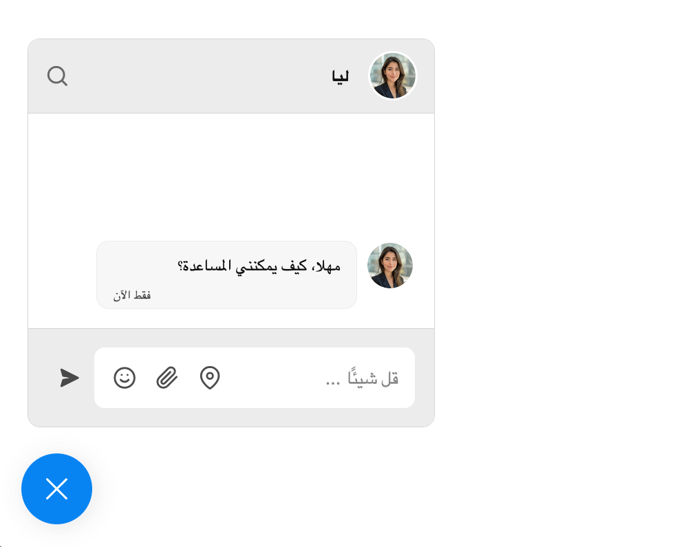
In addition to customizing the appearance of the popup button, you can also change the popup's location on your page. For instance, if your app or site uses a right-to-left language, such as Arabic or Urdu, it might be more natural to place the popup on the left side of your page.
The popup creates its own floating container. You can change the position of the popup on your page by targeting, in your own styles, the #__talkjs_launcher id to change the position of the popup open and close button, and the .__talkjs_popup class to move the popup window.
Note: You’ll need to adjust the position of both the popup button and the popup window separately, to make sure that the popup window opens near its open and close button.
For example, to place the popup in the bottom left of your site, you can use the following code snippet in your own styles:
.__talkjs_popup {
  left: 0;
}

#__talkjs_launcher {
  left: 20px;
}
Which will result in the following:
Note that you can only show a single popup widget per page at any one time.
Build your own popup button
If you prefer to build your own popup open and close button instead, that’s totally possible too. You can disable the default popup button entirely, and create your own button from scratch.
To disable the popup open and close button, set the popup launcher property to "never" when calling createPopup. Once you have your own custom button, you can then call popup.show() to display the popup window, and popup.hide() to close the popup window when your user clicks your custom button.
Resources
This guide has covered three ways of customizing the popup UI's open and close button, as well as the option to create your own custom button.
If you would like to customize other aspects of the popup UI, such as the popup window itself, you can change nearly everything directly via themes. You can access the theme editor from the Themes page of your TalkJS dashboard.
For further resources on working with the popup UI, see: